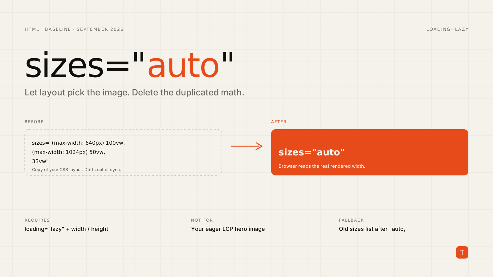
Responsive images have always had an awkward split. Your CSS decides how wide an image is on screen, and then you describe that same layout a second time in the sizes attribute so the browser can pick a file from srcset before layout exists. Anyone who has maintained a sizes string like (max-width: 640px) 100vw, (max-width: 1024px) 50vw, 33vw knows how quickly it drifts out of sync with the stylesheet.
The auto keyword removes that duplication, and it just got a lot easier to rely on. Safari 27.0 shipped on September 17 with support for sizes="auto", and web.dev's September 2026 roundup lists it among the features that became Baseline this month. If you serve images to a general audience, this is a good moment to simplify.
What sizes="auto" actually does
Normally the browser has to choose an image candidate from srcset early, while parsing HTML, before it knows the rendered size of the element. sizes is your hint about that future layout width.
With sizes="auto", the browser uses the element's real layout width instead. According to the HTML Standard, when the image allows auto-sizes and is being rendered, auto represents the element's concrete object size width. No media conditions, no vw arithmetic, and nothing to keep in sync with your CSS.
The catch: it only works with lazy loading
This is the part people miss. Per MDN's documentation, sizes="auto" requires loading="lazy", and you should set width and height to the intrinsic dimensions of the largest image in your srcset.
The reason is timing. An eager image is fetched during HTML parsing, before layout, so there is no layout width to use. A lazy image is deferred until it's near the viewport, by which point layout has run and the browser knows how wide the box is.
That has a direct consequence: do not put sizes="auto" on your LCP image. The hero image should be eager, ideally with fetchpriority="high", and should keep an explicit sizes value. Auto-sizing is for everything below the fold.
A minimal example
Here is a card grid image before:
<img
  src="/img/product-800.jpg"
  srcset="/img/product-400.jpg 400w,
          /img/product-800.jpg 800w,
          /img/product-1600.jpg 1600w"
  sizes="(max-width: 640px) 100vw,
         (max-width: 1024px) 50vw,
         33vw"
  width="1600" height="1200"
  alt="Product photo"
  loading="lazy">
And after:
<img
  src="/img/product-800.jpg"
  srcset="/img/product-400.jpg 400w,
          /img/product-800.jpg 800w,
          /img/product-1600.jpg 1600w"
  sizes="auto"
  width="1600" height="1200"
  alt="Product photo"
  loading="lazy">
If the grid changes from three columns to four next quarter, the image selection follows the layout automatically. Nobody has to remember that a sizes string exists.
Fallbacks and graceful degradation
You don't have to choose between the new and old approach. MDN documents that when auto can't resolve, whether because the browser doesn't support it or the image has no layout size yet, the browser falls back to the source sizes listed after auto, then to the width and height attributes, then to the default 300 by 150 size.
So a defensive version keeps your old string as a fallback:
<img
  loading="lazy"
  width="1600" height="1200"
  sizes="auto, (max-width: 640px) 100vw, (max-width: 1024px) 50vw, 33vw"
  srcset="/img/product-400.jpg 400w,
          /img/product-800.jpg 800w,
          /img/product-1600.jpg 1600w"
  src="/img/product-800.jpg"
  alt="Product photo">
Browsers that understand auto use real layout. Others read the list as before. Once your analytics show the older engines are negligible for your audience, delete the tail.
Gotchas worth testing
Set dimensions on the element. The spec notes that dimensions should come from width and height attributes or CSS; otherwise an image can render at the default 300 by 150 and the browser will pick a candidate for a box that isn't the one users see. The usual img { max-width: 100%; height: auto; } reset is fine, and the width/height attributes also reserve space to protect against layout shift.
Layout changes after load. The selection is based on the width when the image is evaluated. Check how your design behaves on resize and orientation change in the browsers you care about, and verify in the Network panel that the file you expect is the one requested.
Frameworks that generate sizes for you. If you use an image component that emits sizes from props, check whether it passes through "auto" unchanged. Some components validate or rewrite the attribute. If yours does, you can usually set the attribute directly on a plain <img> for below-the-fold content.
Don't lazy-load everything just to use it. Lazy-loading an above-the-fold image to get auto trades a template convenience for a slower Largest Contentful Paint. Keep the hero eager and explicit.
Why this matters for performance
Wrong sizes values fail in both directions. Too small a hint and you ship a blurry image to a high-density screen. Too large and you send a 1600-pixel file into a 400-pixel slot, burning mobile bandwidth for no visible gain. Because hand-maintained strings go stale, most sites drift toward the second failure and quietly overserve. Letting the browser read the actual layout width removes that source of error.
It is also a maintainability win. Fewer copies of layout logic means fewer places for a redesign to leave a performance regression behind.
Takeaways
- Add
sizes="auto"to lazy-loaded, below-the-fold images, along withwidthandheightattributes. - Keep an explicit
sizesvalue, and eager loading, on your LCP image. - During rollout, append your old
sizeslist afterautoas a fallback. - After deploying, compare requested image bytes in the Network panel on a few breakpoints to confirm the right candidates are chosen.
- Remove the legacy
sizesstrings from templates once your browser analytics justify it.
It's a small attribute value, but it replaces a piece of duplicated, easy-to-break configuration with something the browser can compute better than we can. If you want help auditing image delivery on a site you ship, get in touch.