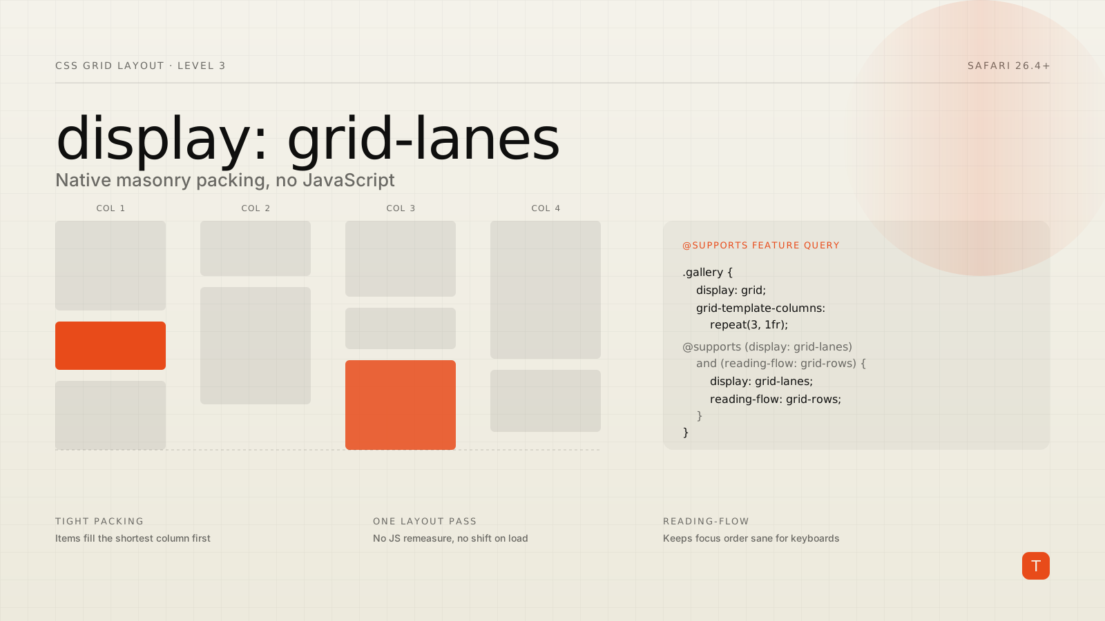
Masonry layout — the Pinterest-style grid where items pack tightly into whichever column has the most room, instead of leaving ragged gaps under short items — has been a CSS wishlist item since Firefox first prototyped it in Nightly back in 2020. It's arriving for real now, and the syntax that's shipping is not the one most people expected.
Safari 26.4 became the first stable browser to ship the finalized spec, under the name display: grid-lanes rather than the display: masonry or grid-template-rows: masonry syntax that circulated in earlier proposals (MDN). Chrome and Edge have had a masonry prototype behind a flag since version 140, and are now updating it to match the renamed, finalized syntax; Firefox — the original pioneer here — is doing the same with its long-standing Nightly implementation (WebKit blog). None of this is Baseline yet, but it's close enough, and consequential enough, to start planning for now.
What Grid Lanes actually is
Grid Lanes is defined in CSS Grid Layout Level 3. Conceptually, it's a hybrid: strict grid tracks on one axis, and a packing algorithm — not a strict grid — on the other. In the column-based case, which is what most people mean by "masonry," you define grid columns exactly like you would with display: grid, and items are placed into whichever column currently has the least content, packing as tightly as possible on the row axis.
.gallery {
  display: grid-lanes;
  gap: 10px;
  grid-template-columns: repeat(auto-fill, minmax(220px, 1fr));
}
That's the whole layout. No JavaScript measuring image heights, no position: absolute with manually computed top offsets, no library recalculating on every resize. The browser lays out each item in its box, measures where the shortest column currently ends, and drops the next item there.
You can also flip the axis — items load into rows while columns use the masonry algorithm — by swapping in grid-template-rows, and spanning items work the same way they do in ordinary grid, with grid-column-end: span 2 pulling an item across multiple lanes while auto-placement continues to fill in around it.
.gallery {
  display: grid-lanes;
  gap: 10px;
  grid-template-columns: repeat(auto-fill, minmax(220px, 1fr));
}

.featured {
  grid-column-end: span 2;
}
Where browser support actually stands
As of this Safari release, support looks like this:
Safari 26.4 and later ships display: grid-lanes in stable, on both macOS and iOS. Chrome and Edge 140+ have a masonry implementation behind a flag (about:flags → "CSS Masonry Layout"), built against an earlier syntax proposal, and are in the process of updating it to the grid-lanes naming the CSS Working Group settled on. Firefox has supported some form of masonry in Nightly since 2020 under the original grid-template-rows: masonry syntax and is migrating that implementation to match the new spec, including a new flow-tolerance property discussed below (WebKit blog).
In practical terms: you have one shipping stable implementation, two flagged ones actively catching up, and no committed Baseline date. That's exactly the situation @supports was built for.
The accessibility catch nobody should skip
Masonry's whole appeal is that it reorders items visually to pack space efficiently — and that's precisely what makes it risky for keyboard and screen-reader users. When the browser is free to place item 7 above item 3 because column 3 happened to have room first, your DOM order (which drives tab order and reading order for assistive tech) can end up completely disconnected from the visual order on screen. A sighted keyboard user tabs to what looks like the wrong item entirely.
The CSS Working Group's answer to this is the reading-flow property, which lets you tell the browser to derive tab order from the actual visual layout (reading-flow: grid-rows) instead of DOM source order. Manuel Matuzović's guidance, based on testing Safari's early implementation, is to treat grid-lanes and reading-flow as a package deal rather than shipping one without the other:
.gallery {
  display: grid;
  grid-template-columns: repeat(3, 1fr);

  @supports (display: grid-lanes) and (reading-flow: grid-rows) {
    display: grid-lanes;
    reading-flow: grid-rows;
  }
}
Where reading-flow isn't available, the fallback is flow-tolerance, a property that constrains how far out of DOM order the layout is allowed to place items before it stops trying to pack tightly and falls back to something closer to source order:
.gallery {
  display: grid;
  display: grid-lanes;
  grid-template-columns: repeat(3, 1fr);
  flow-tolerance: infinite;
}
Setting flow-tolerance: infinite tells the browser to prioritize packing efficiency over matching DOM order — useful for a purely decorative image wall, wrong for a gallery where item order carries meaning (Matuzović, "Progressively enhancing Grid Lanes").
Why this is worth adopting before it's Baseline
The display: grid; display: grid-lanes; double-declaration pattern above is a cascade trick, not a hack: browsers that don't recognize grid-lanes as a valid value simply ignore that line and keep the ordinary grid declared above it. That means you can ship the enhanced layout today, with zero runtime cost in unsupported browsers and zero JavaScript in any browser.
That last point matters for performance, not just code simplicity. JavaScript masonry libraries (Masonry.js and friends) work by measuring rendered item heights after layout, then repositioning everything with computed offsets — which means a layout pass, a paint, then a second layout pass once positions are known, visible to users as items visibly jumping into place. That's a direct contributor to Cumulative Layout Shift. Native grid-lanes computes final positions in the same layout pass as everything else, with no visible reflow and no shipped library weight.
Taking it further
Before reaching for Grid Lanes in production:
Audit whether your masonry content actually needs reading-flow. A photo gallery where order is decorative can reasonably use flow-tolerance: infinite; a card list where sequence matters (search results, a task board) should keep DOM order close to visual order and use reading-flow: grid-rows rather than letting the packing algorithm run unconstrained.
Wrap every grid-lanes declaration in the @supports (display: grid-lanes) and (reading-flow: grid-rows) feature query shown above, with an ordinary display: grid fallback that already looks acceptable — not a broken intermediate state.
Test keyboard navigation specifically, not just visual appearance, in Safari 26.4+ where the feature actually ships today. Tab through the gallery and confirm focus moves in an order that makes sense, at multiple viewport widths, since the number of columns — and therefore the packing pattern — changes with them.
Watch caniuse rather than assuming Chrome and Firefox will land the renamed syntax on any particular date; both are mid-migration from earlier prototypes, and flagged implementations can change behavior between releases.
Grid Lanes won't be safe to ship without a fallback for a while yet. But the CSS-only progressive enhancement path is cheap enough, and the layout-shift savings real enough, that it's worth wiring in now rather than waiting for a Baseline badge.