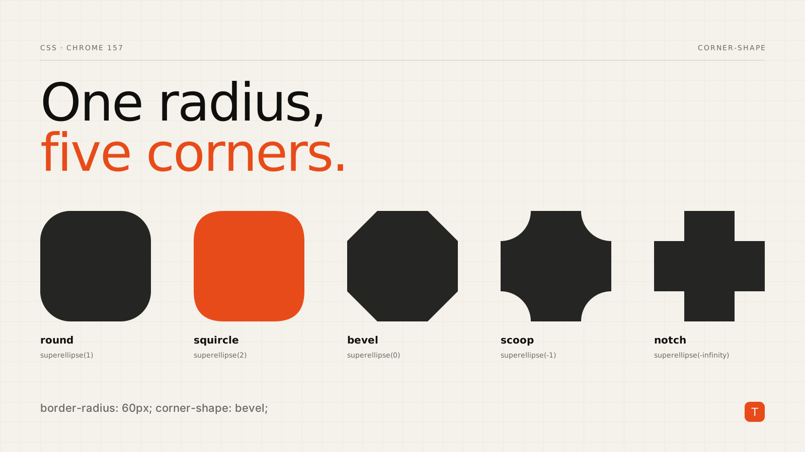
For fifteen years, "rounded corners" has meant one thing: a quarter circle. Anything else, such as a bevelled ticket, a scooped coupon edge or the continuous-curve "squircle" of an app icon, meant reaching for clip-path, an SVG mask, or a stack of pseudo-elements. Each of those breaks something: borders get clipped, box shadows vanish, and the markup gets heavier.
The corner-shape property fixes that at the source. It has been in Chromium since Chrome 139, and the Chrome 157 release notes add corner shorthand properties that set border-radius and corner-shape for each corner in a single declaration. Here is what it does, how to use it today, and where it is not ready.
What corner-shape actually does
corner-shape does not replace border-radius. It changes the curve that the radius draws. According to MDN's reference, the shape is applied within the area defined by border-radius, and if the radius is zero the property has no effect.
.card {
  border-radius: 20px;
  corner-shape: squircle;
}
The keywords map onto a single mathematical idea, the superellipse() function:
| Keyword | Equivalent |
|---|---|
square |
superellipse(infinity) |
squircle |
superellipse(2) |
round (initial value) |
superellipse(1) |
bevel |
superellipse(0) |
scoop |
superellipse(-1) |
notch |
superellipse(-infinity) |
Positive values bulge outward, negative values curve inward. You can pass any number to superellipse() for in-between shapes, and values interpolate smoothly, so a hover transition from round to bevel just works.
Why this beats clip-path
The practical win is that the shape is a real box shape, not a mask laid over it. MDN notes that background-color, background-image, border, outline, box-shadow, overflow and backdrop-filter all follow the custom corner shape. With clip-path, the border and shadow are cut off along with everything else, so you end up faking them with extra wrapper elements or filter: drop-shadow().
A ribbon-style badge illustrates the difference. The example below, adapted from Smashing Magazine's walkthrough, needs no pseudo-elements:
.ribbon {
  border-radius: 0 16px 16px 0;
  corner-shape: round bevel bevel round;
}
Per-corner values follow the usual order: top-left, top-right, bottom-right, bottom-left. Fewer values follow the familiar shorthand expansion (one value for all corners, two for opposite pairs, and so on).
Good fits include:
- Badges, tags and ribbons where a bevel or notch signals direction or status.
- Pricing cards, where the featured plan can carry the most distinctive corner and the shape reinforces hierarchy.
- Avatars and album art where a squircle matches the rounded-square look users already know from app icons.
- Testimonial or coupon blocks where scooped corners give a printed-ticket feel.
What Chrome 157 adds
Chrome 157 ships corner shorthand properties. Per the Chrome Platform Status release notes, they let you set the radius and the shape for a corner together instead of in two declarations. Coverage of the release, including GIGAZINE's summary, describes a family of per-corner properties such as corner-top-left and corner-bottom-right, plus logical variants such as corner-block-start that follow writing direction.
I am deliberately not printing a value-syntax example for the new shorthands here. The release notes describe what they do but not their grammar, and the specification is still a working draft (CSS Borders and Box Decorations Module Level 4), so check the current spec text and MDN before you rely on a specific form. The established corner-shape longhands, including corner-top-left-shape and the logical corner-start-start-shape family listed on MDN, are the safer choice for production code until the shorthands settle.
Shipping it safely
This is a progressive-enhancement feature, not a baseline one. As of Smashing's March 2026 article, corner-shape worked in Chrome 139+ and other Chromium browsers, and not in Firefox or Safari. MDN currently flags it as experimental with limited availability. Verify the compatibility table before launch, because that picture may have changed.
The safe pattern is to make the fallback a complete design, then layer the enhancement behind @supports:
.tag {
  border-radius: 12px; /* complete design everywhere */
}

@supports (corner-shape: bevel) {
  .tag {
    corner-shape: bevel;
  }
}
Because corner-shape only modifies a curve that border-radius already draws, the fallback is automatic: browsers that ignore the property render ordinary rounded corners, and nothing breaks. That is a much better failure mode than clip-path, where an unsupported or mis-sized mask can hide content.
Two behaviors to keep in mind from MDN:
- If opposite corners would overlap, the browser reduces the radius to prevent it, so very large radii on small elements will not look the way you specify.
corner-shapehas no effect alongsideborder-shape, which ignoresborder-radius.
The performance and maintenance angle
This is a CSS-only change, but it touches performance in two modest ways. Removing wrapper elements and pseudo-elements that existed only to fake a shape trims DOM size and style work. Replacing SVG masks or clip-path polygons also removes assets and hard-coded geometry that need to be re-tuned every time the component's size changes. I would not promise a measurable Core Web Vitals gain from this alone, and I have not seen published benchmarks, so treat it as a maintainability and cleanliness win first.
Takeaways
- Use
corner-shapefor decorative shapes that currently depend onclip-path, masks, or pseudo-element tricks, especially where you also need borders and shadows to follow the shape. - Always set a
border-radius; without it the property does nothing. - Wrap the enhancement in
@supports (corner-shape: ...)and make sure theborder-radius-only version is a finished design. - Prefer the documented longhands for per-corner control today, and revisit the Chrome 157 shorthands once the spec and MDN catch up.
- Check browser support right before shipping, since support outside Chromium was absent as of March 2026.
If your design system still carries a folder of corner-shaped SVG masks, this is a good release to audit it against.